 ROIX
FOREX - RISK OVER REGRET ROIX
FOREX - RISK OVER REGRET
ROIX
FOREX - RISK OVER REGRET ROIX
FOREX - RISK OVER REGRET1.0 CANDLESTICKS
1.1 WHAT IS A CANDLESTICK?
1.2 POPULAR 4 CANDLESTICK PATTERNS
1.2.1 DOJI FAMILY
1.2.2 ENGULFING GROUP
1.2.3 HAMMER AND SHOOTING
STAR
1.2.4 HARAMI
2.0 CHART PATTERNS
2.1 TREND REVERSAL PATTERNS
2.1.1 HEAD & SHOULDERS
2.1.2 DOUBLE TOP & BOTTOM
2.1.3 TRIPLE TOP & BOTTOM
2.2 TREND CONTINUATION PATTERNS
2.2.1 TRIANGLES
2.2.2 FLAGS & PENNANT
2.2.3 WEDGES
2.2.4 RECTANGLES
3.0 TRADING INDICATORS
3.1 MOVING AVERAGES
3.1.1 WHAT IS A “MOVING AVERAGE -MA”?
3.1.2 EXPONENTIAL MOVING AVERAGE CALCULATION,
EMA
3.2 FIBONACCI EXTENSIONS AND CHANNELS
3.3 BOLLINGER BANDS
3.4 STOCHASTIC (OVERBOUGHT vs
OVERSOLD)
3.5 MACD
3.6 ICHIMOKU INDICATOR
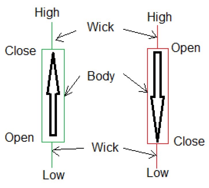
A candlestick is a chart that displays the high, low, opening and closing prices of a security for a specific period. The wide part of the candlestick is called the “real body” and tells investors whether the closing price was higher or lower than the opening price. Black/red indicates that the price closed lower and white/green indicates that the price closed higher. Candlesticks reflect the impact of investor sentiment on security prices and are used by technical analysts to determine when to enter and exit trades. Candlestick charting is based on a technique developed in Japan in the 1700s for tracking the price of rice.
Candlesticks are a suitable technique for trading any liquid financial asset such as stocks, Foreign Exchange and Futures. Candlestick chart patterns are the ways to look at price fluctuations in different financial products such as commodities, stock, equities and Foreign Exchange. These patterns reveal the overall market sentiment at any given time. Most of the time, candlestick patterns are standalone and do not require any other indicators.
Following 4 types of patterns are important to be aware of in Financial Market:
1- Doji Family
2- Engulfing Group
3- Hammer and Shooting
Star (Reversal
Candlesticks)
4- Harami (bullish and bearish)
Doji candlesticks are widely used as strong indication of market price reverse. They consist of a single horizontal line showing that both the closing and opening prices are identical.
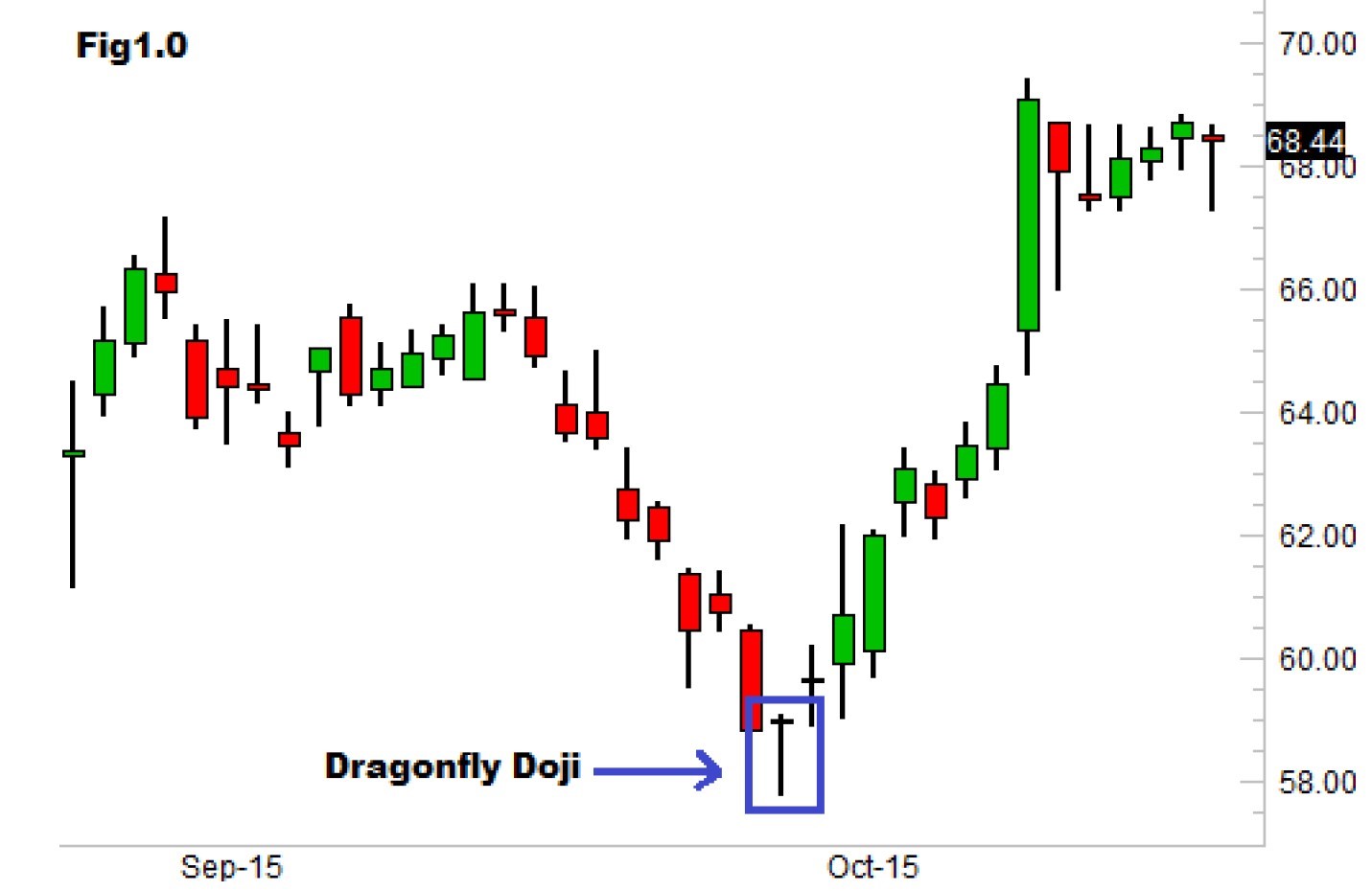
-Dragonfly doji pattern: is a relatively difficult chart pattern to find, but when it is found within a defined trend it is often deemed to be a reliable signal that the trend is about to change direction. As you can see from the chart, on the day of the dragonfly doji, traders realize that the price was sold down to unjustifiably low levels so they send the price back up to where the stock opened. The close near the day’s open suggests that demand is again starting to outweigh supply.
RECOGNITION:
there
is an overall downtrend in the market; the bullish dragonfly doji
appears at the bottom of the trend; the doji has an extremely long
lower
shadow; the doji does not have any upper shadow. When it appears, you should place
a buy trade!
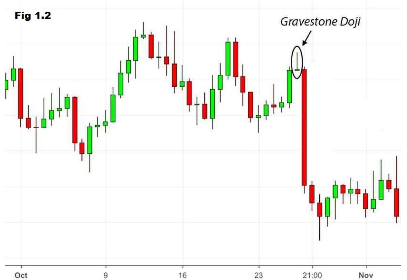
- Gravestone Doji Pattern: is a common reversal pattern used by traders to suggest that a bullish rally or trend is about to reverse. It can also be found at the end of a downtrend, but this version is much rarer. As you can see from the chart below, on the day of the gravestone doji, bearish traders realized that the price was pushed up to unjustifiably high levels so they send the price back up to where the market opened. The close near the day’s low suggests that supply is starting to outweigh demand again.
RECOGNITION: market is characterized by an uptrend; the doji is usually preceded by a white candlestick before it; doji candle appears with no lower shadow; upper shadow of the doji is usually long. When it appears, you should place a sell position.
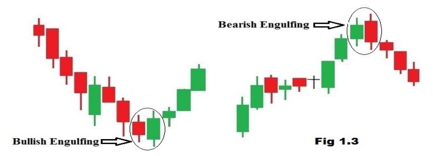
-A Bullish engulfing pattern: is a chart pattern that forms when a small black candlestick is followed by a large white candlestick that completely eclipses or “engulfs” the previous day’s candlestick. The shadows or tails of the small candlestick are short, which enables the body of the large candlestick to cover the entire candlestick from the previous day. Where a bullish engulfing candle forms in the context of the trend is one of the most important factors. When a bullish engulfing candle forms at the end of a downtrend, the reversal is much more powerful as it represents a capitulation bottom. The lows of the candle should be the low of the downtrend. This is usually preceded by a minimum of four consecutive lower low candles prior to the bullish engulfing candle.
RECOGNITION: market is characterized by a downtrend; small black body can be seen; the next candle indicates a white body that completely engulfs the black real body of the preceding candle. When it appears, you should place a buy position.
-A Bearish engulfing pattern: is a chart pattern that consist of a small white candlestick with short shadows or tails followed by a large black candlestick that eclipses or “engulfs” the small white one. As implied by its name, a bearish engulfing pattern may provide an indication of a future bearish trend. It is the end of an upward trend, marked by the primary candle of upward momentum being overtaken, or engulfed, by a larger secondary candle indicating a shift toward a downtrend. This is particularly relevant when the secondary opening price is higher than the primary price. Additionally, the further down the secondary candle goes, beyond the lower edge of the primary candle, the more significant the downward trend indicator.
RECOGNITION: market is characterized by an uptrend; small white candlestick at the top of the trend followed by a black candlestick that completely engulfs the body of the prior white candle. When it appears, you should place a sell position.
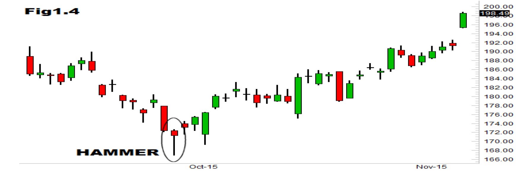
-A hammer: is a price pattern in candlestick charting that occurs when a security trades significantly lower than its opening, but rallies later in the day to close either above or near its opening price. This pattern forms a hammer-shaped candlestick, in which the body is at least half the size of the tail or wick.
RECOGNITION: the market is characterized by prevailing downtrend; small body can be seen at the bottom of the downtrend; ideally, lower shadow should be at least twice the length of the body; colour of the body is not important; there is no upper shadow. When it appears, you should place a buy position.
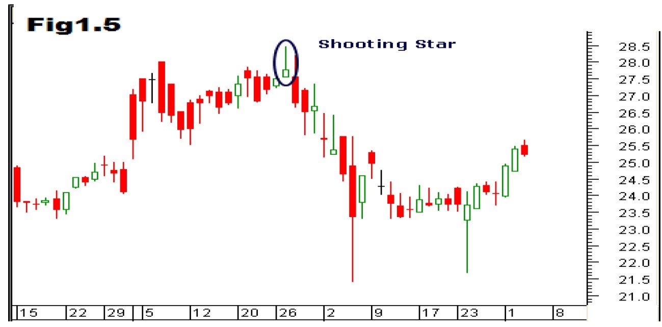
-A Shooting Star: is a type of candlestick formation that results when a security’s price, at some point during the day, advances well above the opening price but closes lower than the opening price.
RECOGNITION: market is characterized by an uptrend; white candlestick near the top; prices then open with a gap up, creating a small real body at the top of the uptrend; upper shadow of the pattern on the second candle is usually at the least twice as long as the real body; shooting star candle has no lower shadow, and the colour of the body is not important. When it appears, you should place a sell position.
The candle that forms after the shooting star is what confirms the shooting star candle. The next candle must fail to make a higher high and then proceed to close under the close of the prior candle. This represents the trapped buyers who quickly realize they may have overpaid for the position as the price stops rising. When the second candle closes lower than the prior candle low, it indicates that every buyer on the shooting star candle is now underwater. The tension builds until the proverbial trap door opens. Greed turns into fear as liquidity vaporizes, which in turn causes more panic pullback that could turn into a trend reversal.
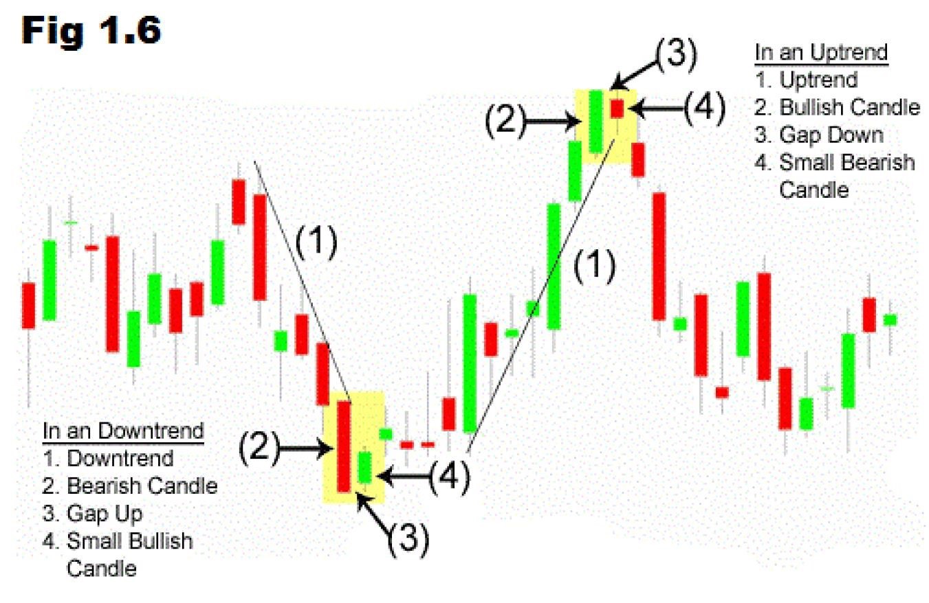
-A Bullish Harami: a bullish harami is a candlestick chart pattern in which a large candlestick is followed by a smaller candlestick whose body is located within the vertical range of the larger body. The bullish harami is a downtrend or bearish candlestick (red) engulfing a small bullish candlestick (green), giving a sign of a reversal of the downward trend. Since the bullish harami indicates the bearish trend may be reversing, it may be a good time to enter into a long position.
RECOGNITION: market is characterized by a downtrend; black candle at the bottom can be seen with the closing price near the low; the next candle opens with a gap up and has a smaller, white body; the body of the smaller white candle is engulfed by the previous black body. When it appears, you should place a buy position.
-A Bearish Harami: is a trend indicated by a large candlestick followed by much smaller candlestick with a body located within the vertical range of the larger candle’s body. Such a pattern is an indication that the previous upward trend is coming to an end.
RECOGNITION: market is characterized by an uptrend; white candle at the top with closing price near the high; the next candle opens with a gap and has a smaller, black body; the body of the smaller black candle is engulfed by the previous white body.When it appears, you should place a sell position.
There
are millions of different investors transacting billions of
dollars’ worth of securities each day and it’s nearly impossible to
decipher
everyone’s motivations. Chart patterns look at the big picture and help
to
identify trading signals – or signs of future price movements. One of
the three
assumptions discussed earlier in chapter two was that history repeats
itself.
The theory behind chart patterns is based on this assumption that certain patterns consistently reappear
and tend to produce the same outcomes. For example, as market
sentiment
shifts from optimism to fear, a certain pattern might emerge before
traders and
investors start selling and send the stock price lower.
The two most
popular chart patterns are reversals and continuations. A reversal
pattern
signals that a prior trend will reverse upon completion of the pattern,
while a
continuation pattern signals that the trend will continue once the
pattern is
complete. These
patterns can be found across any timeframe.
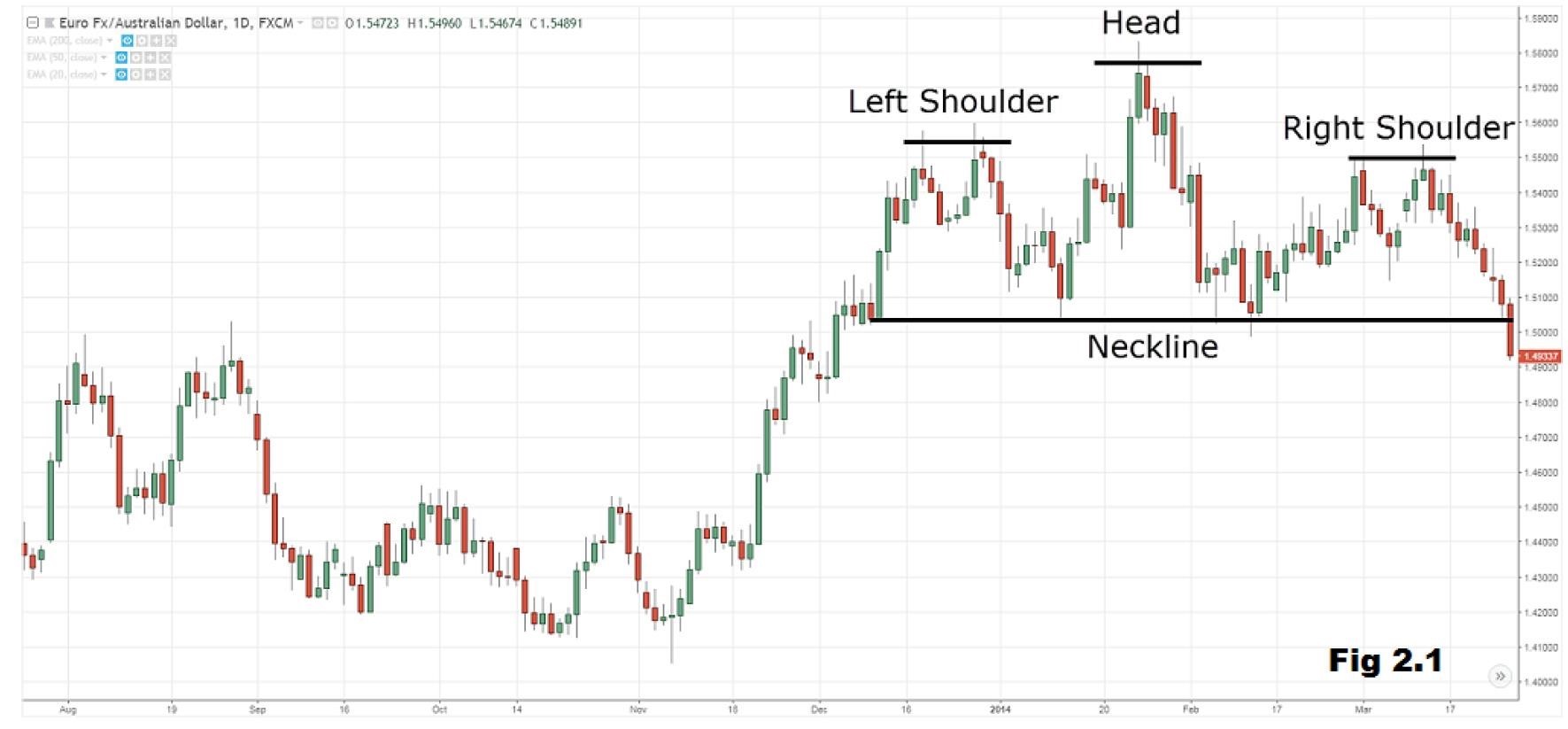
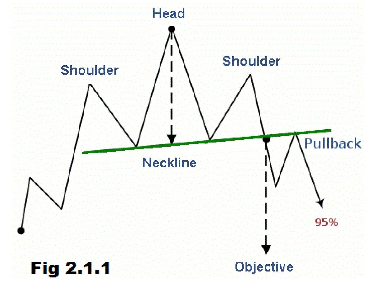
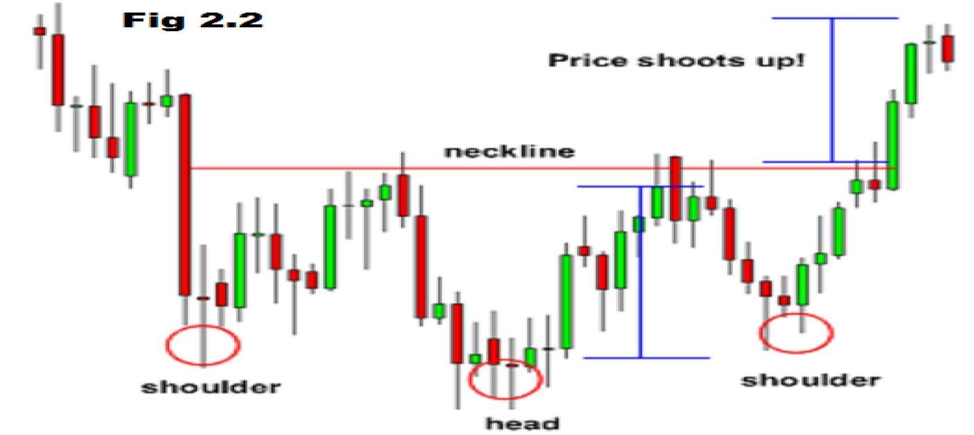
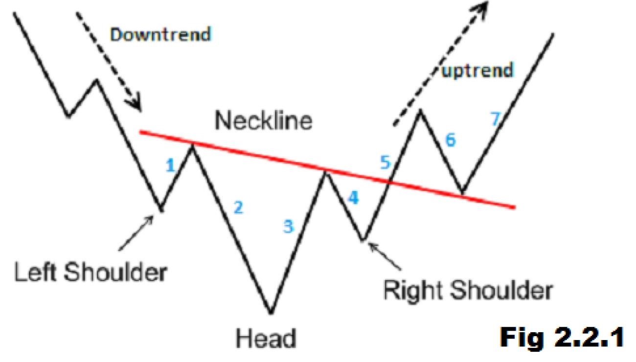
The head and shoulders is a reversal chart pattern that indicates a likely reversal of the trend once it’s completed. A head and shoulders Top is characterized by three peaks with the middle peak being the highest peak (head) and the two others being lower and roughly equal (shoulders). The lows between these peaks are connected with a trend line (neckline) that represents the key support level to watch for a breakdown and trend reversal. A head and shoulder bottom – or inverse Head and Shoulders – is simply the inverse of the Head and Shoulders Top with the neckline being a resistance level to watch for a breakout higher.
When this pattern is formed, you should open a sell position below the neckline after you price has broken it or wait for a pullback for confirmation!
What
is an “Inverted Head and Shoulders”?
A
suitable profit target can be ascertained by measuring the distance
between the bottom of the head and the neckline of the pattern and
using that
same distance to project how far the price may move in the direction of
the
breakout. For example, if the distance between the head and neckline is
10
pips, the profit target is set 10 pips above the pattern’s neckline. An
aggressive stop loss order can be placed below the breakout price bar
or
candle.
Alternatively,
a conservative stop loss order can be placed below the
right shoulder of the inverse head and shoulders pattern.
When this pattern is formed, you should place a buy position when the price rises above the resistance of the neckline or wait for a pullback for confirmation.
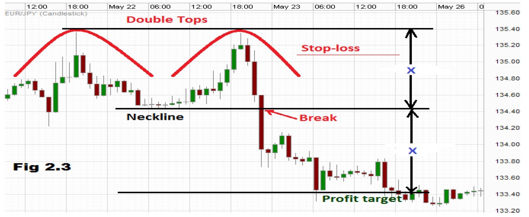
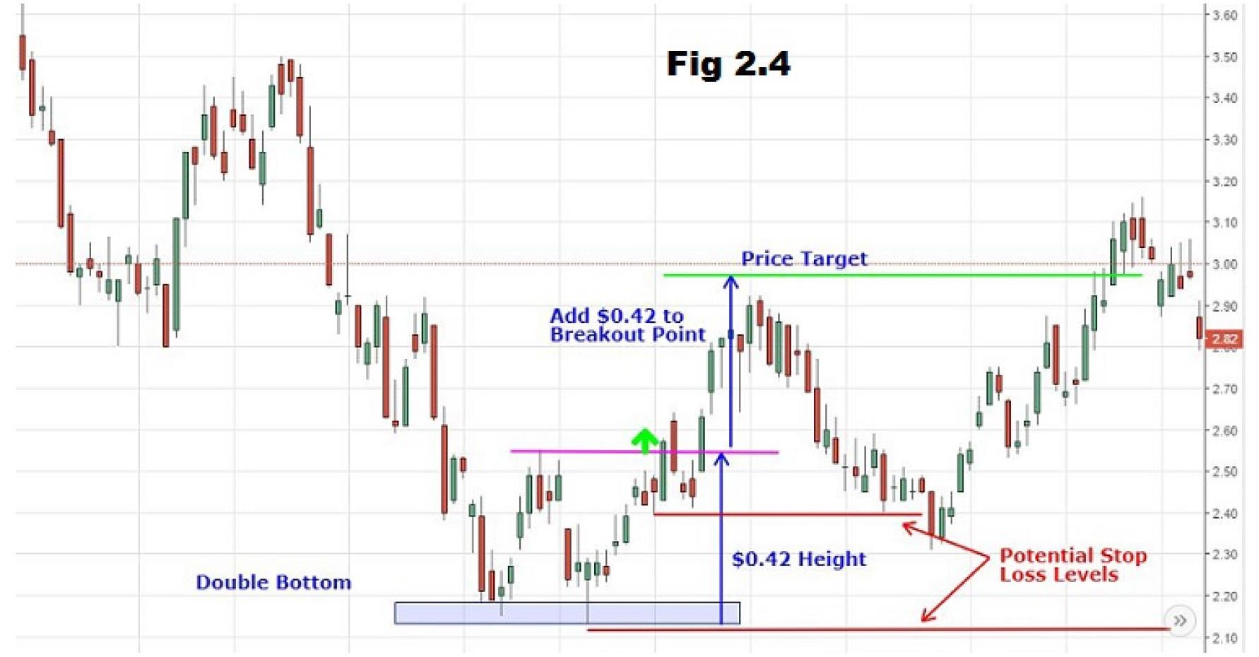
The Double Top or Double Bottom pattern are both easy to recognize and one of the most reliable chart patterns, making them a favourite for many technically-orientated traders. The pattern is formed after a sustained trend when a price tests the same support or resistance level twice without a breakthrough. The pattern signals the start of a trend reversal over the intermediate- or long-term.
When a double top is formed, you should place a sell position.
When a double bottom is formed, you should place a buy position.
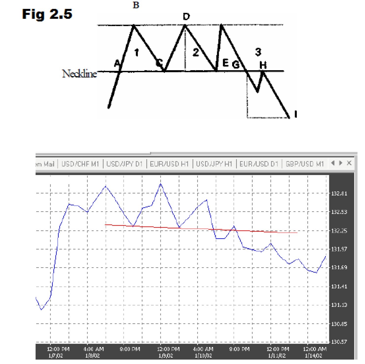
The triple top: is a hybrid of the head-and-shoulders and double-top trend reversal formations (See Fig 2.5). Consequently, they have the same characteristics, potential problems, signals, and trader’s point of view as the double top or double bottom, respectively. As shown in Fig 2.5, in a typical tripletop formation, the tops have about the same height. A parallel line (the neckline) is drawn against the line connecting the three tops (B, D, and F). As a resistance line, the neckline is broken at point A. It turns into a strong support for price levels at С and E, but eventually fails at point G. The support line turns into a strong resistance line, which holds the market backlash at point H. The price objective is at level I, which is the average height of the three tops formation, as measured from point D. As a double top, the formation fails at point E. The price moves up steeply toward point F. The resistance line is holding once more and the price drops sharply again toward point G. At this level, the market pressure is able to penetrate the support line. After a possible retest of the neckline, the prices drop further, to eventually reach the price objective.
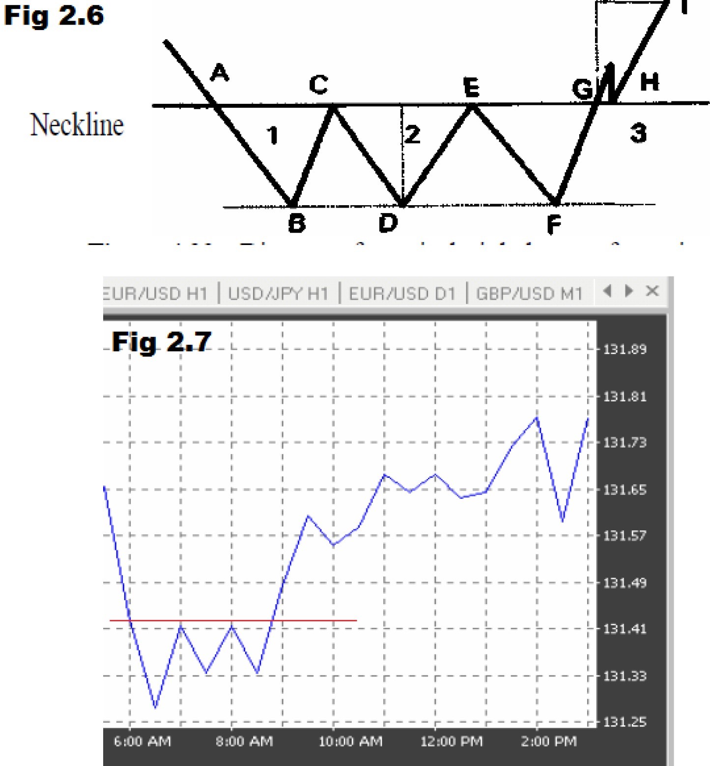
The Triple Bottom: is a hybrid of the double top and inverted head-andshoulders patterns (See Fig 2.6 and 2.7). As shown in Fig 2.6 and 2.7, in a triplebottom formation, the bottoms have about the same amplitude. A parallel line (the neckline) is drawn against the line connecting the three bottoms (B, D, and F). As a support line, the neckline is broken at point A. It turns into a strong resistance for price levels at С and E, but eventually fails at point G. The resistance line turns into a strong support line, which holds the market backlash at point H. The price objective is at level I, which is the average length of the triple-bottom formation, as measured from point D.
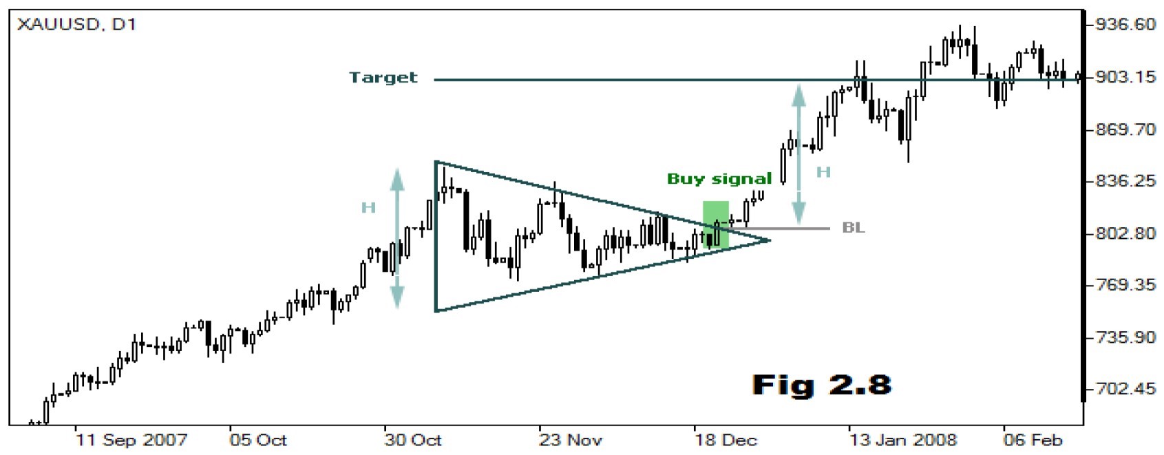
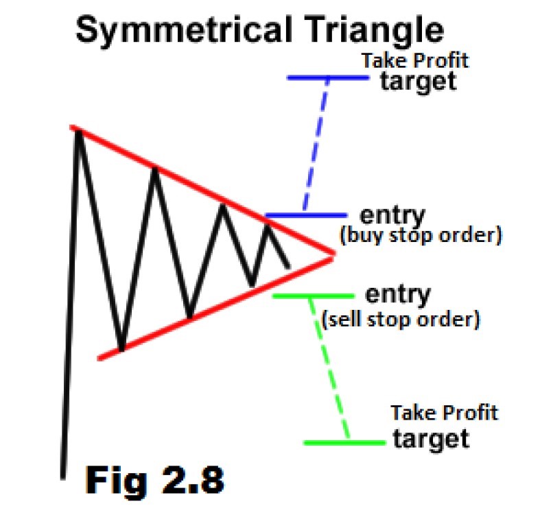
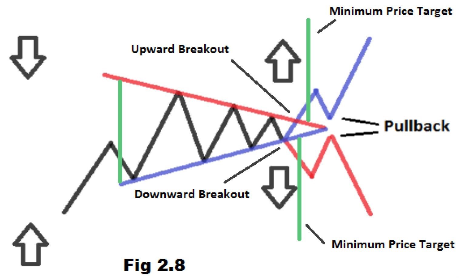
Triangles are among the most popular chart patterns used in technical analysis since they occur frequently compared to other patterns. The three most common types of triangles are Symmetrical Triangles, Ascending Triangles, and Descending Triangles. These chart patterns can last anywhere from a couple weeks to several months.
Symmetrical triangles occur when two trend lines converge toward each other and signal only that a breakout is likely to occur – not the direction. Ascending triangles are characterized by a flat upper trend line and rising lower trend line and suggest a breakout higher is likely, while descending triangles have a flat lower trend line and descending upper trend line that suggests a breakdown is likely to occur. The magnitude of the breakouts or breakdowns is typically the same as the height of the left vertical side of the triangle (see fig 2.8). A symmetrical triangle is generally regarded as a period of consolidation before the price moves beyond one of the identified trend lines. A break below the lower trend line is used by technical traders to signal a move lower, while a break above the upper trend line signals the beginning of a move upward. As you can see from the chart fig 2.8, technical traders use a sharp increase in volume or any other available technical indicator to confirm a breakout beyond one of the trend lines.
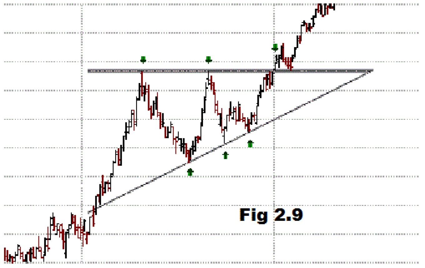
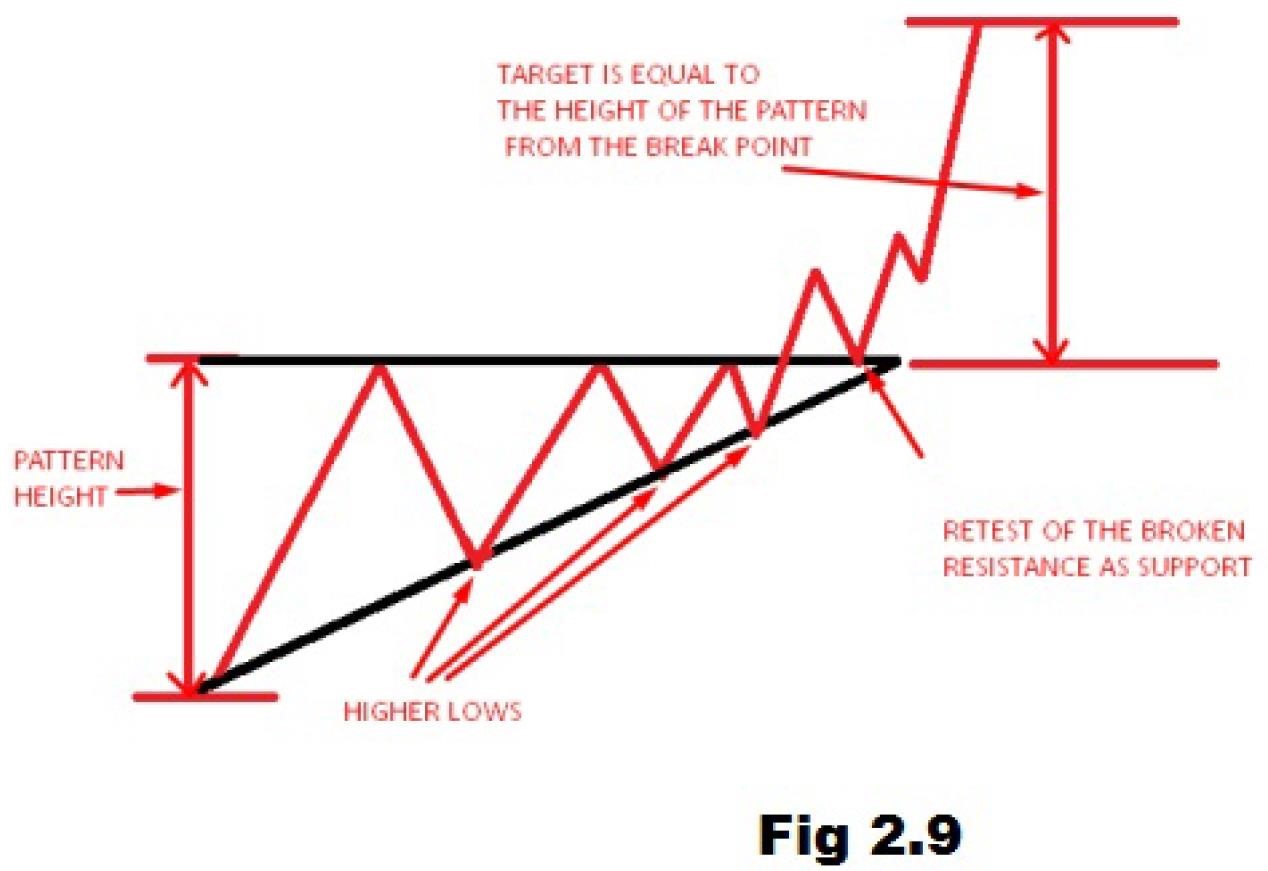
An ascending triangle is generally considered to be a continuation pattern, meaning that it is usually found amid a period of consolidation within an uptrend. Once the breakout occurs, buyers will aggressively send the price of the asset higher, usually on high volume. The most common price target is generally set to be equal to the entry plus the vertical height of the triangle (see fig 2.9).
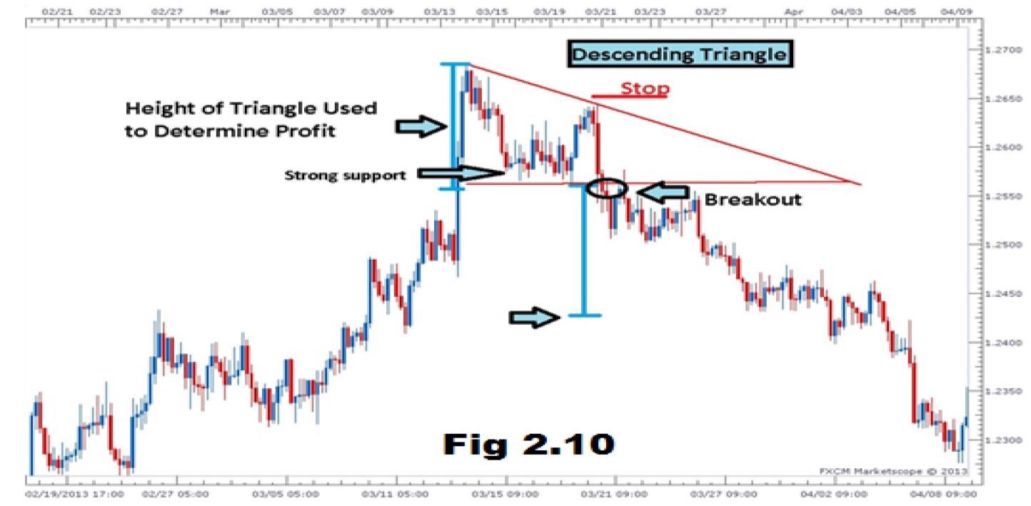
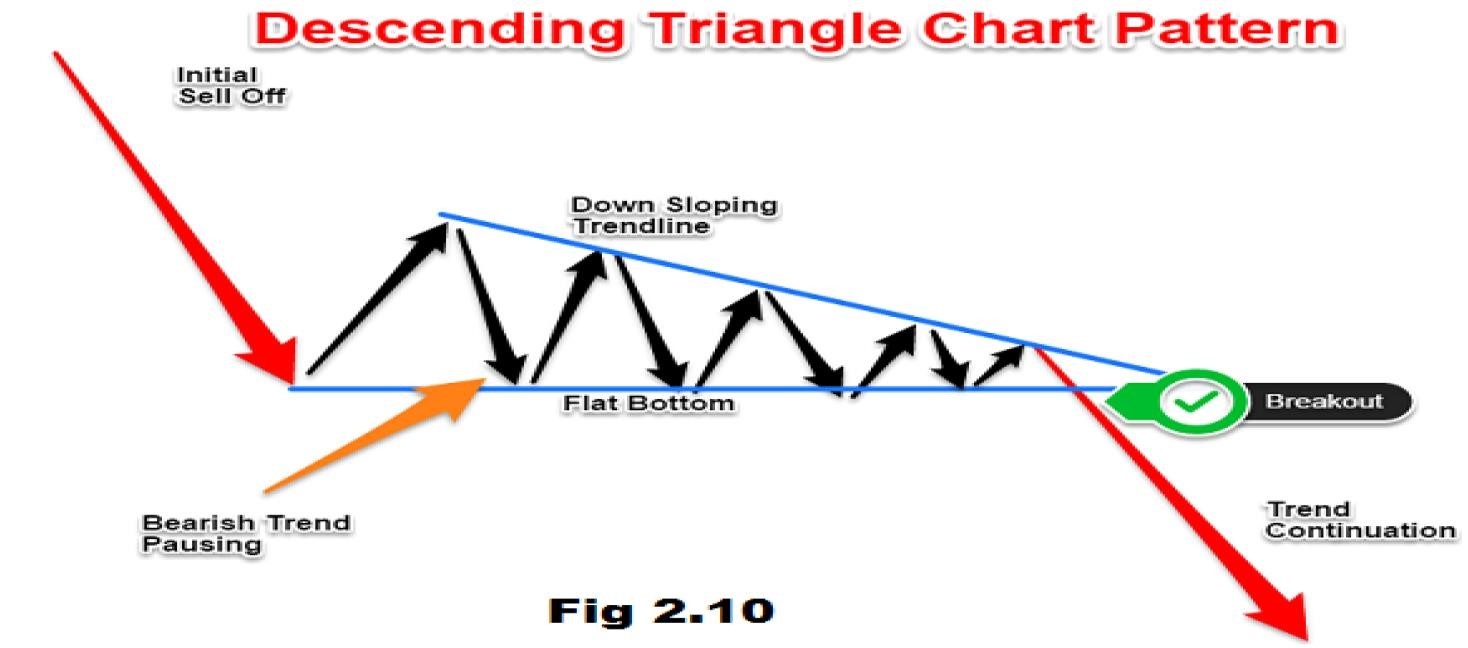
This is a very popular tool among traders because it clearly shows that the demand for an asset is weakening, and when the price breaks below the lower support, it is a clear indication that downside momentum is likely to continue or become stronger. Descending Triangles give technical traders the opportunity to make substantial profits over a brief period of time. The most common price targets are generally set to equal the entry minus the vertical height between the two trend lines.
A descending triangle
is the bearish counterpart of an ascending triangle (see fig 2.10).
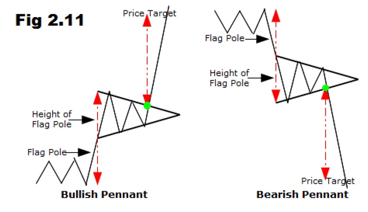
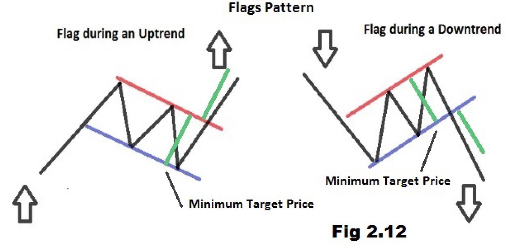
The flag and pennant patterns are two continuation patterns that closely resemble each other, differing only in their shape during the pattern’s consolidation period. This is the reason the terms flag and pennant are often used interchangeably. A flag is a rectangle shape, while the pennant looks more like a triangle.
These two patterns are formed when there is a sharp price movement followed by generally sideways price movement, which is the flag or pennant. The pattern is complete when there is a price breakout in the same direction of the initial sharp price movement. The following move will see a similarly sharp move in the same direction as the prior sharp move. The complete move of the chart pattern – from the first sharp move to the last sharp move – is referred to as the flag pole.
The pennant forms what looks like a symmetrical triangle, where the support and resistance trend lines converge towards each other. The pennant pattern does not need to follow the same rules found in triangles, where they should test each support or resistance line several times. Also, the direction of the pennant is not as important as it is in the flag; however, the pennant is generally flat (see fig 2.11).
The flag pattern forms what looks like a rectangle. The rectangle is formed by two parallel trend lines that act as support and resistance for the price until the price breaks out. In general, the flag will not be perfectly flat but will have its trend lines sloping. The buy or sell signal is formed once the price breaks through the support or resistance level, with the trend continuing in the prior direction. This breakthrough should be on heavier volume to improve the signal of the chart pattern (see fig 2.12).
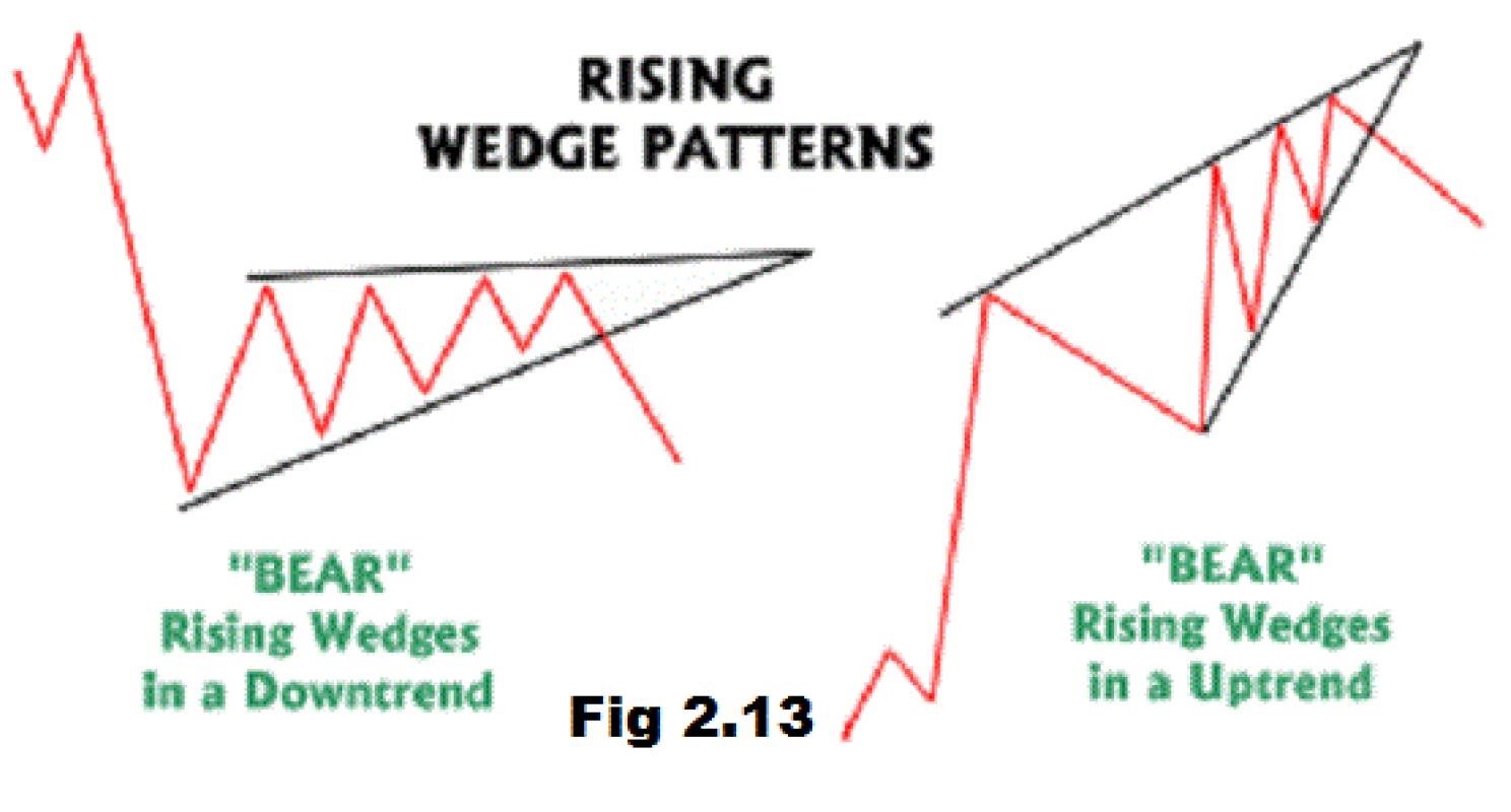
A rising wedge is formed when price consolidates between upward sloping support and resistance lines. Here, the slope of the support line is steeper than that of the resistance. This indicates that Higher Lows are being formed faster than Higher Highs. This leads to a wedge-like formation, which is exactly where the chart pattern gets its name from!
With
prices consolidating, we know that a big splash is coming, so we
can expect a breakout to either the top or bottom.
If
the rising wedge forms after an uptrend, it’s usually a bearish
reversal pattern. On the other hand, if it forms during a downtrend, it
could
signal a continuation of the down move.
Either way, the important thing is that, when you spot this Forex trading chart pattern, you are ready with your entry orders. Again, the price movement is bounded by the two converging trend lines. As the price moves towards the apex of the pattern, momentum is weakening. A move below the lower support would be viewed by traders as a reversal in the upward trend.
As the strength of the buyers weakens (exhibited by their inability to take the price higher), the sellers start to gain momentum. The pattern is complete, with the sellers taking control of the security, when the price falls below the supporting trend line. (See fig 2.13).
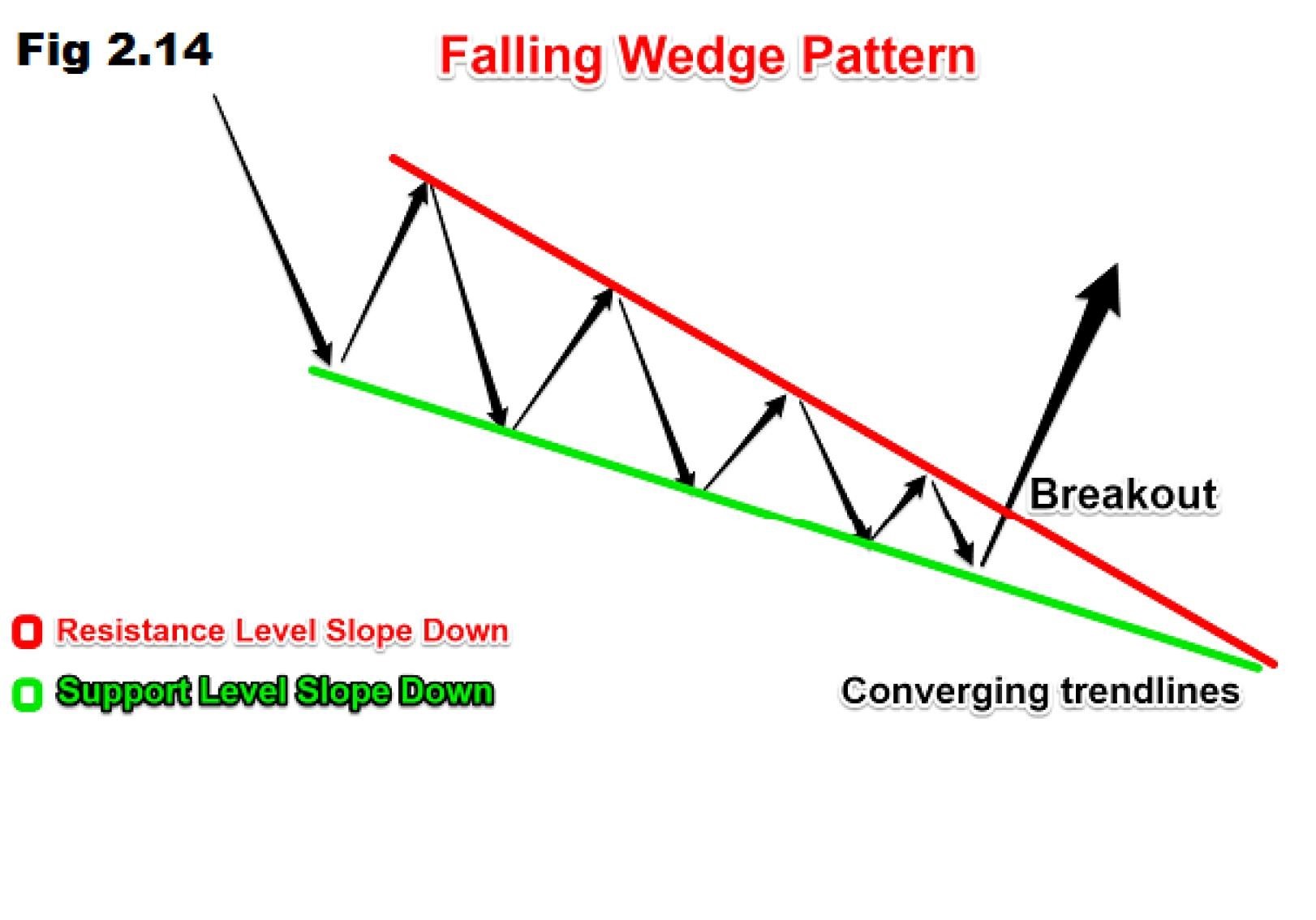
The falling wedge is a generally bullish pattern signalling that one will likely see the price break upwards through the wedge and move into an uptrend. The trend lines of this pattern converge, with both being slanted in a downward direction as the price is trading in a downtrend.
Another thing to look at in the falling wedge is that the upper (or resistance) trend line should have a sharper slope than the support level in the wedge construction. When the lower (or support) trend line is clearly flatter as the pattern forms, it signals that selling pressure is waning, as sellers have trouble pushing the price down further each time the security is under pressure. (See fig 2.14).
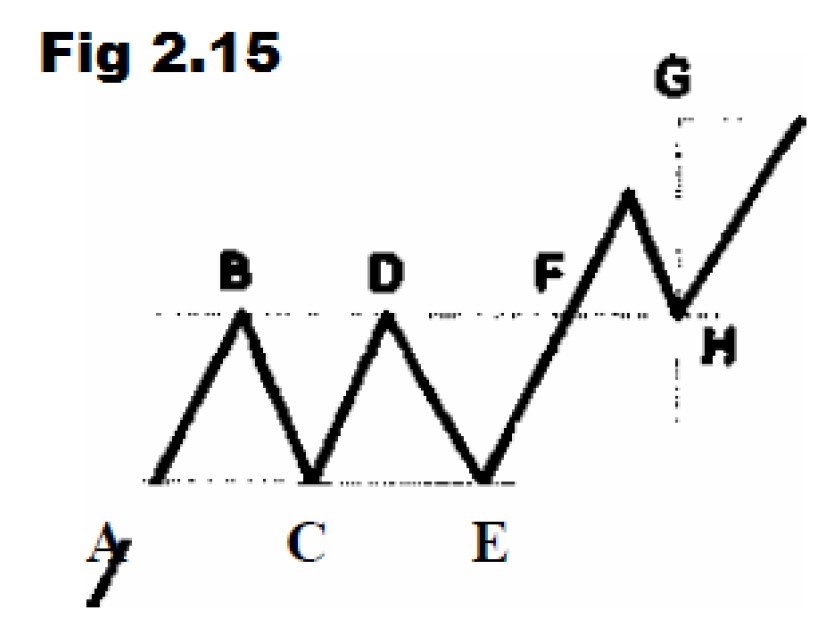
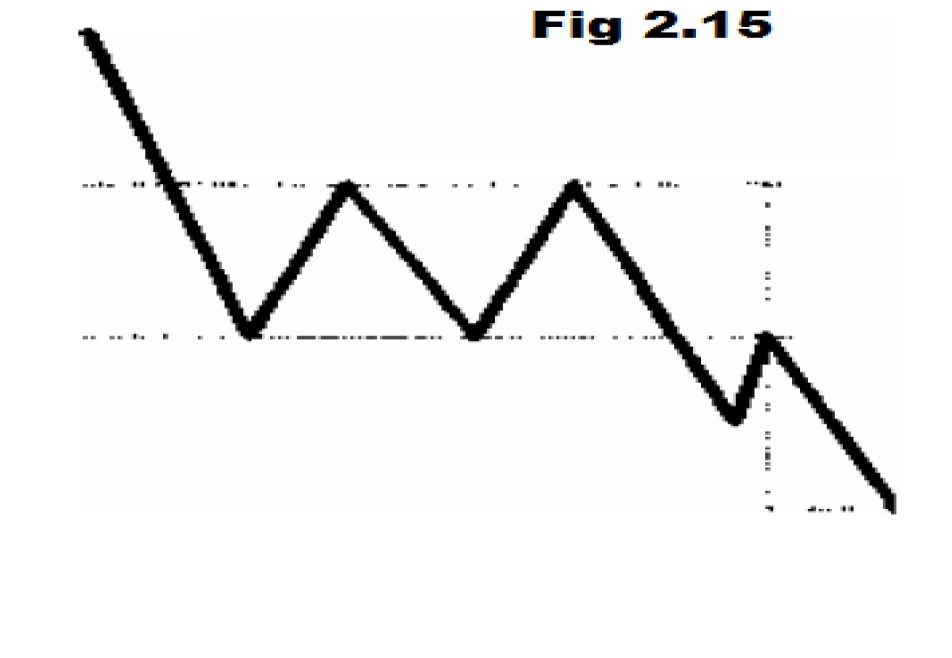
The rectangle formation reflects a consolidation period. Upon breakout, it is likely to continue the original trend. Its failure will change it from a continuation to a reversal pattern. This pattern is easy to spot, as it can be considered a minor side-ways trend. If it occurs within an up-trend and the breakout occurs on the upside, it is called a bullish rectangle (See Fig 2.15). The price objective is the height of the rectangle. As Fig 2.15 shows, the currency moves between well-defined, flat support and resistance levels. A valid breakout may occur on either side from this consolidation period. The price target (GH) is equal to the height of the rectangle (G’H), measured from the breakout point H.
Many investors and active traders use technical trading indicators to help identify high probability trade entry and exit points. Hundreds of indicators are available on most trading platforms; therefore, it is easy to use too many indicators or to use them inefficiently. This article will explain how to select multiple indicators, how to avoid information overload and how to optimize indicators to most effectively take advantage of these technical analysis tools.
Technical indicators are mathematical calculations based on a trading instrument’s past and current price and/or volume activity. Technical analysts use this information to evaluate historical performance and to predict future prices. Indicators do not specifically provide any buy and sell signals; a trader must interpret the signals to determine trade entry and exit points that conform to his or her own unique trading style. Several different types of indicators exist, including those that interpret trend, momentum, volatility and volume.
A
widely used indicator in technical analysis that helps smooth out
price action by filtering out the “noise” from random price
fluctuations. A
moving average (MA) is a trend-following or lagging indicator because
it is
based on past prices. The two basic and commonly used MAs are the
Simple Moving
Average (SMA), which is the simple average of a security over a defined
number
of time periods, and the Exponential Moving Average (EMA), which gives
bigger
weight to more recent prices. The most applications of MAs are to
identify the
trend direction and to determine support and resistance levels. While
MAs are
useful enough on their own, they also form the basis for other
indicators such
as the Moving Average Convergence Divergence (MACD).
Why
use a Moving
Average?
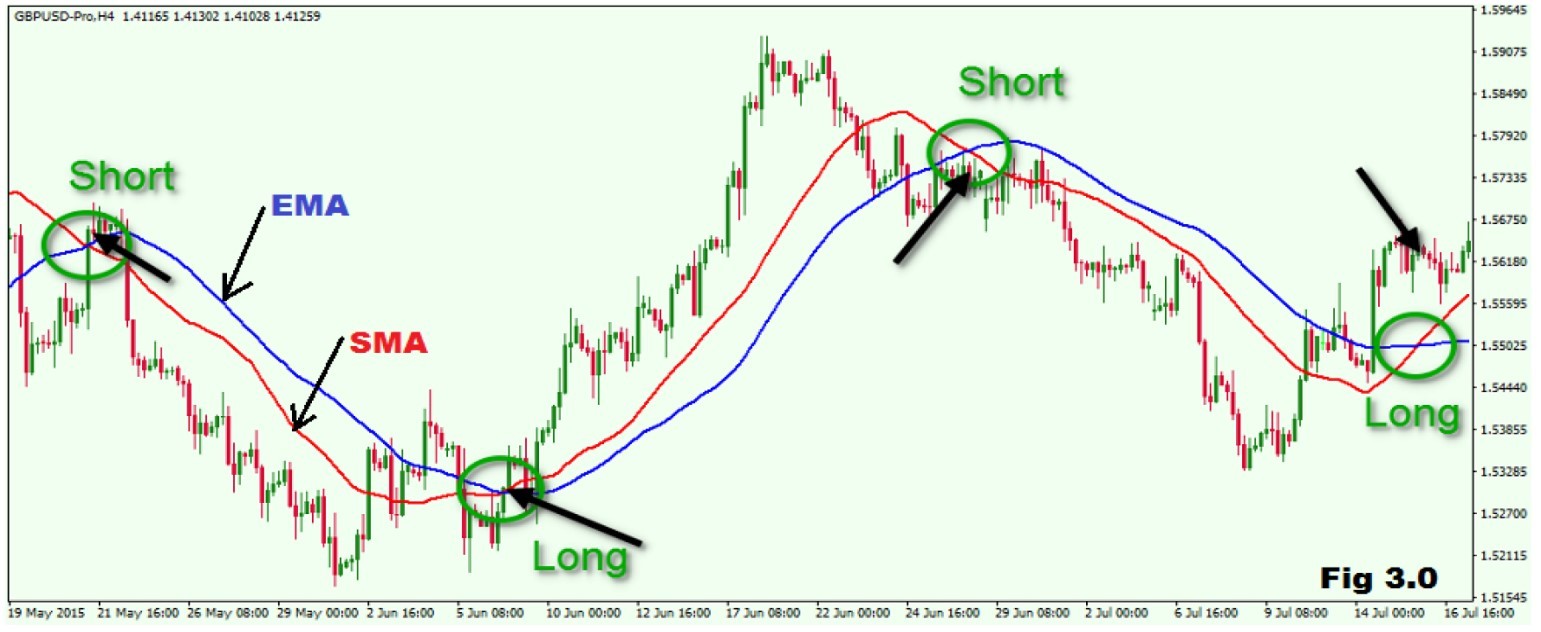
A Moving Average can help cut down the amount of “noise” on a price chart. Look at the direction of the moving average to get a basic idea of which way the price is moving. Angled up and the price is moving up (or was recently) overall, angled down and the price is moving down overall, moving sideways and the price is likely in a range.
Trend Identification
The
same signals can be generated using simple or exponential moving
averages. As noted above, the preference depends on each individual.
These
examples below will use both simple and exponential moving averages.
The term
“moving average” applies to both simple and exponential moving averages.
The
direction of the moving average conveys important information about
prices. A rising moving average shows that prices are generally
increasing. A
falling moving average indicates that prices, on average, are falling.
A rising
long-term moving average reflects a long-term uptrend. A falling
long-term
moving average reflects a long-term downtrend (see fig 3.0).
Exponential moving average reduce the lag by applying more weight to recent prices. The weighting applied to the most recent price depends on the number of periods in the moving average. There are three steps to calculating an exponential moving average. First, calculate the simple moving average. An exponential moving average (EMA) has to start somewhere so a simple moving average is used as the previous period’s EMA in the first calculation. Second, calculate the weighting multiplier. Third, calculate the exponential moving average.
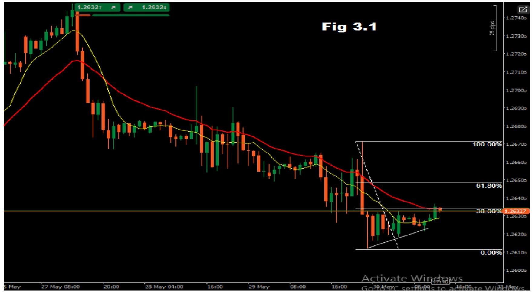
Fibonacci retracement is a very popular tool among technical traders and is based on the key numbers identified by mathematician Leonardo Fibonacci in the thirteenth century. However, Fibonacci’s sequence of numbers is not as important as the mathematical relationships, expressed as ratios, between the numbers in the series.
In technical analysis, Fibonacci retracement is created by taking two extreme points (usually a major peak and trough) on a Forex chart and dividing the vertical distance by the key Fibonacci ratios of 23.6%, 38.2%, 50%, 61.8% and 100%. Once these levels are identified, horizontal lines are drawn and used to identify possible support and resistance levels. Before we can understand why these ratios were chosen, we need to have a better understanding of the Fibonacci number series. (For a more indepth discussion of this subject, google Fibonacci and the golden ratio.)
The Fibonacci sequence of numbers is as follows: 0, 1, 1, 2, 3, 5, 8, 13, 21, 34, 55, 89, 144, etc.
Each term in this sequence is simply the sum of the two preceding terms and the sequence continues infinitely.
One of the remarkable characteristics of this numerical sequence is that each number is approximately 1.618 times greater than the preceding number. This common relationship between every number in the series is the foundation of the common ratios used in retracement studies.
The key Fibo ratio of 61.8% – also referred to as “the golden ratio” or “the golden mean” – is found by dividing one number in the series by the number that follows it. For example: 8/13=0.6153, and 55/89=0.6179.
The 38.2% ratio is found by dividing one number in the series by the number that is found two places to the right. For example: 55/144=0.3819.
The 23.6% ratio is found by dividing one number in the series by the number that is three places to the right. For example: 8/34=0.2352.
For reason that are unclear, these ratios seem to play an important role in the Foreign Exchange market, just as they do in nature, and can be used to determined critical points that cause an asset’s price to reverse. The direction of the prior trend is likely to continue once the price of the asset has retraced to one of the ratios listed above. The following chart illustrates how Fibonacci retracement can be used. Notice how the price changes direction as it approaches the support/resistance levels. (Draw the Fibo lines from the yesterday’s high to the yesterday’s low price if the chart is trending down. I use the time frame H4 to repair yesterday’s high and low price to draw my fibo lines.) See fig 3.1.
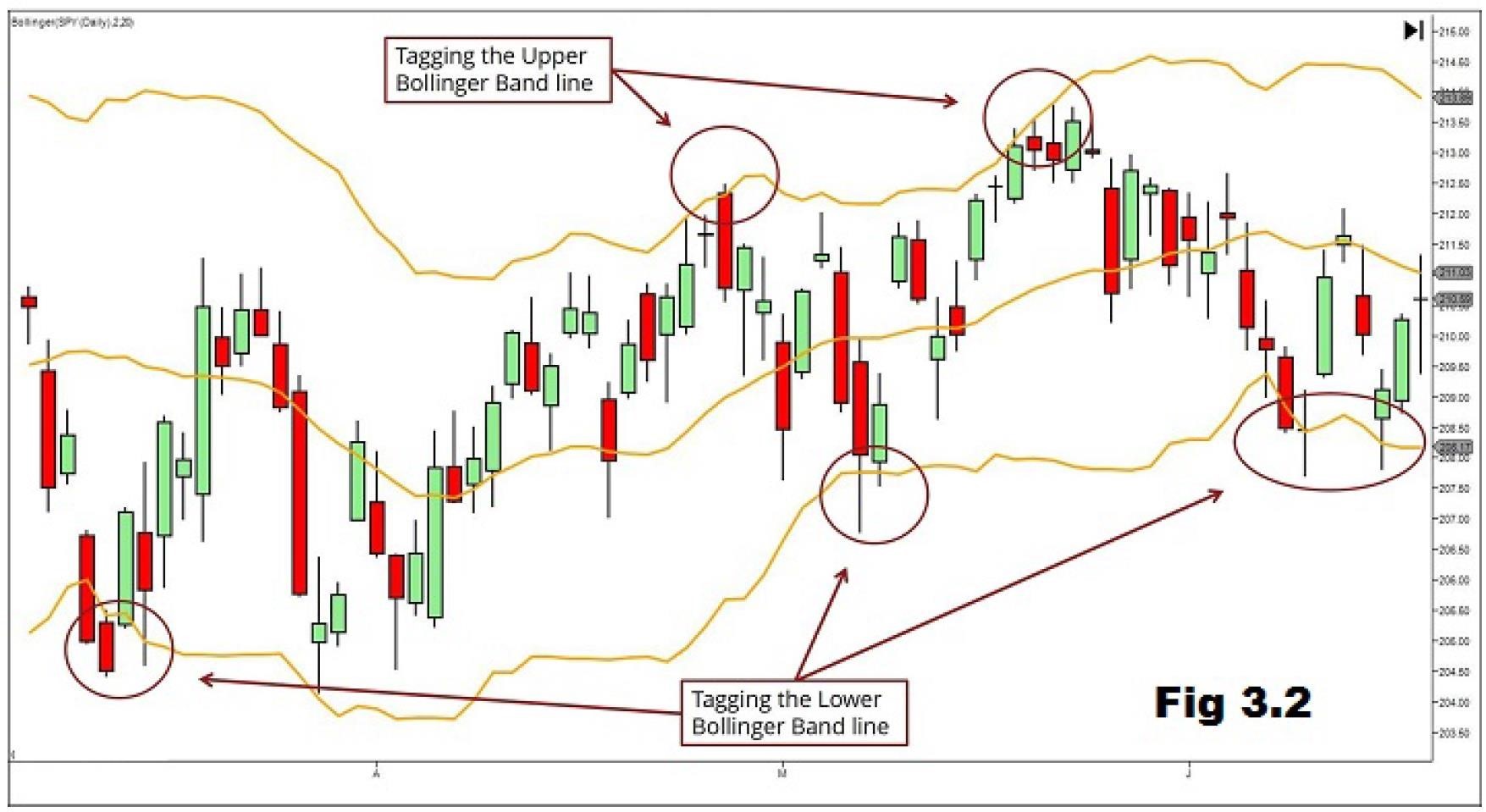
A Bollinger Band, developed by famous technical trader John Bollinger, is plotted two standard deviations away from a simple moving average. Bollinger bands are a powerful technical indicator. Some traders will swear that solely trading a Bollinger bands strategy is the key to their success. Bollinger bands encapsulate the price movement of a stock. It provides relative boundaries of highs and lows.
The
crux of the Bollinger band indicator is based on a moving average
that defines the intermediate-term “trend” of the stock based on the
trading
time frame you are viewing.
This trend
indicator is known as the middle band. Most Forex charting applications
use a
20-period moving average for the default Bollinger bands settings.
The upper and lower bands are then a measure of
volatility to the upside and downside. They
are calculated as two standard deviations from the middle band (see fig
3.2).
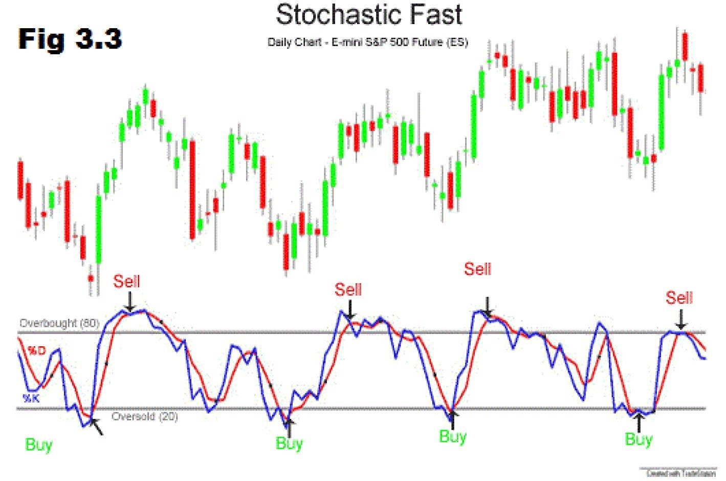
The stochastic oscillator is a momentum indicator comparing the closing price of a security to the range of its prices over a certain period of time. The sensitivity of the oscillator to market movements is reducible by adjusting that time period or by taking a moving average of the result. The general theory serving as the foundation for this indicator is that in a market trending upward, prices will close near the high, and in a market trending downward, prices close near the low (see fig 3.3).
Lane also expressed the important role the stochastic oscillator can play in identifying overbought and oversold levels, because it is range bound. This range – from 0 to 100 – will remain constant, no matter how quickly or slowly a security advances or declines. Considering the most traditional settings for the oscillator, 20 is typically considered the oversold threshold and 80 is considered the overbought threshold. However, the levels are adjustable to fit security characteristics and analytical needs. Readings above 80 indicate a security is trading near the top of its high-low range; reading below 20 indicate the security is trading near the bottom of its high-low range.
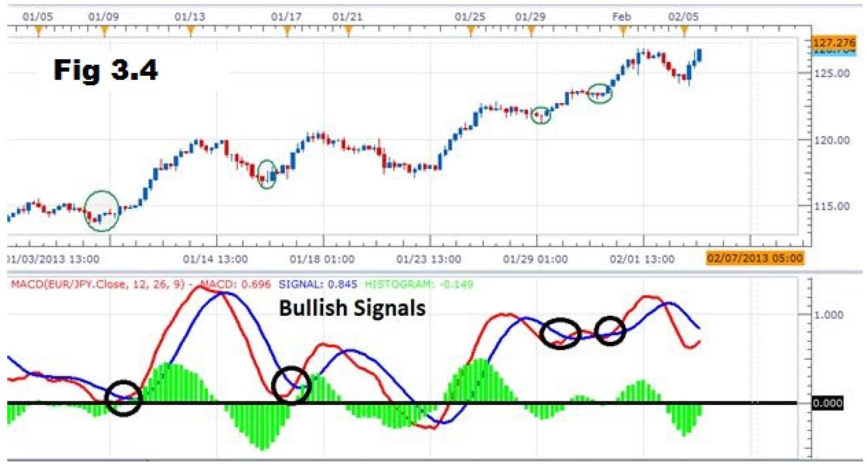
What is the “Moving Average Convergence Divergence – MACD”? Moving Average Convergence Divergence (MACD) is a trend-following momentum indicator that shows the relationship between two moving averages of prices. The MACD is calculated by subtracting the 26-day exponential moving average EMA from the 12-day EMA. A nine-day EMA of the MACD, called the “signal line”, is then plotted on top of the MACD, functioning as a trigger for buy and sell signals.
The
MACD can be used well in trending or ranging markets due to its use
of moving averages provide a vital display of changes in momentum.
After you
have identified the market environment as either ranging or trading,
there are
two things you want to look for to derive signals from this indicator.
First
you want to recognize the lines in relation to the zero line which
identify a crossover or cross under of the MACD line (red) to the
signal line
(bleu) for a buy or sell trade, respectively. (See fig 3.4).
Like all
indicators, the MACD is best coupled with an identified trend or
rangebound
market. Once you’ve identified the trend, it is best to take crossovers
of the MACD
line in the direction of the trend. When you’ve entered the trade, you
can set
stops below the recent price extreme before the crossover, and set a
trade
limit at twice the amount you are risking.
The Ichimoku Kinko Hyo (or simply – Ichimoku) indicator is appointed to determine simultaneously a market trend direction, support and resistance levels and to trigger buy and sell signals. Such a way, this indicator unites in itself a number of other indicators as well as different approaches concerning with the price movement prediction.
CONGRATULATIONS! YOU HAVE COMPLETED CHAPTER 3!
AS A FOREX TRADER, YOU CAN TRADE WITHOUT INDICATORS AND STILL BE PROFITABLE BUT YOU CAN NEVER TRADE WITHOUT MEMORIZING THE CHART PATTERNS, POPULAR CANDLESTICK PATTERNS AND BECOME PROFITABLE! NO WAY!!
NOW IT IS TIME FOR YOU TO CHOOSE MAXIMUM 4 CURRENCY PAIRS AS A BEGINNER AND START IDENTIFYING THE PATTERNS YOU HAVE LEARNT IN THIS CHAPTER, PLEASE DO IT!
© 2024 ETS ROIX. All rights reserved.